

Interior paint color is one of the most consequential design decisions in a home, and one of the least expensive to make.
A color choice can make a room feel spacious or intimate, calming or energizing, warm or cool.
These effects aren't just aesthetic opinion; they reflect consistent patterns in how color influences human perception and mood.
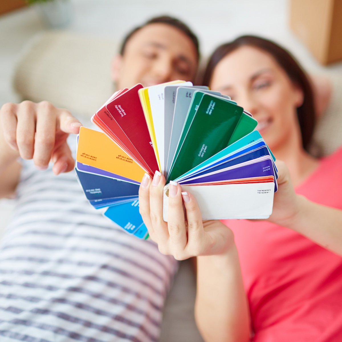
Understanding the basics of color psychology gives homeowners a more useful framework for making paint decisions than simply picking what looks nice on a sample card.
Jump to:
Warm vs. Cool: The Most Important Distinction
Colors on the warm end of the spectrum, reds, oranges, yellows, and warm neutrals, advance visually, making walls feel closer and spaces feel smaller and more intimate.
They stimulate, energize, and create a sense of warmth that works particularly well in social spaces and rooms where activity and conversation happen.
Cool colors, blues, greens, and purple-adjacent tones, recede visually, making spaces feel larger and airier.
They have a calming, quieting effect that suits bedrooms, bathrooms, and spaces where rest or focus is the goal.
Cool colors also tend to feel more formal and professional, which is worth considering for home offices.
What Research Consistently Shows About Specific Colors
Blue is the most consistently calming color across research studies on color and mood, particularly the softer, more muted blue-greens and blue-greys that have dominated interior design for the past decade.
Bedrooms painted in these tones regularly outperform other colors in studies of sleep quality and relaxation.
Yellow in pure, saturated forms is stimulating and can create tension in spaces where relaxation is the goal. In soft, warm cream and buttery tones, it reads differently, as welcoming and optimistic rather than harsh.
The specific shade and saturation level changes the psychological effect of a color dramatically.
Choosing Colors for Different Rooms
The function of a room should drive the color selection. For kitchens and dining rooms, warm tones that stimulate appetite and conversation are generally the right direction, earthy terracottas, warm greens, and classic whites that reflect natural light.
For bedrooms, the research strongly supports softer, cooler tones. For living rooms, the goal is usually a balance, a welcoming warmth without the energy level of a social dining space. Discussing these functional considerations with interior painters Waco TX homeowners trust is often part of the planning conversation before a project begins.
Home offices are a specific case where color choice has measurable productivity implications.
Green has the strongest research support for focus and concentration; it's associated with both calm and mental clarity.
voiding highly stimulating reds and oranges in workspaces that require sustained attention is well-supported by the color psychology literature.
Light Changes Everything
The same paint color behaves completely differently in different lighting conditions. A north-facing room with cool natural light will make a color look more blue and muted than the same color in a south-facing room with warm afternoon light.
A color that looks warm and honey-toned in the morning may shift toward orange under incandescent evening lighting.
This is why sample testing in the actual space, at different times of day and with the room's actual lighting conditions, is essential before committing to a color.
The sample card experience is not the on-wall experience, and that gap is responsible for a significant proportion of paint color regrets.
The Case for Whole-Home Color Coordination
Open-plan homes and spaces with strong sightlines between rooms present a specific design challenge: colors selected room by room can create a disjointed, patchwork effect when visible simultaneously.
A whole-home color strategy, selecting a cohesive palette of complementary tones rather than making each room a standalone decision, produces a more harmonious overall result.
This doesn't mean every room needs to be the same color. It means the colors are chosen to relate well to each other, have the same undertone family, be compatible in warm or cool orientation, and have intentional variation in depth and saturation that creates visual interest without visual conflict.
FAQ’S
Light, cool colors, soft blues, pale greens, and clean whites with cool undertones, visually expand small spaces by receding from the eye. High-gloss or semi-gloss finishes also reflect more light and contribute to a more open feeling. Painting trim and walls the same color (or very similar tones) reduces visual boundaries and can also make a small room feel more generous.
Significantly. A white ceiling raises the perceived height of a room. A ceiling painted the same color as the walls creates a cocooning effect that feels intimate. A ceiling a shade or two lighter than the wall color is a subtle trick that feels expansive without looking stark. Most design professionals recommend intentionally addressing the ceiling rather than defaulting to a flat white without considering the effect.
- Parents Are Prioritising Breathable, Sustainable Fabrics For Children's Seasonal Sleepwear
- Our Homemade Christmas Printables, Made With AI: What Worked, What Didn't, and What I'm Saving for Next Year
- At-Home vs. In-Lounge IV Therapy in the Hudson Valley: Which Makes More Sense?
- Can Passengers Pursue Compensation After a Car Accident?




Wrapping Up
Color selection for interior paint is one of those decisions where a little informed thinking pays off significantly in the long run.
Understanding the psychological effects of warm vs cool colours, how light transforms colour on the wall, and how to build a cohesive whole-home palette gives homeowners a framework for making choices they'll still be happy with years down the road.





Leave a Reply