

Color reaches the brain long before textures or thread counts register. Before you notice how soft the sheets feel, your mind already responds to the colors on the bed.
That first impression shapes whether the room feels calm, energizing, playful, or heavy.
Bedding covers a large visual area, so it carries more influence than most decor pieces.
A single duvet can soften sharp lines, brighten a dark space, or turn a plain room into a quiet retreat.
Thoughtful color choices at the foot of the bed and across the pillows change how you experience the entire bedroom each time you walk in.
Jump to:
Color Psychology And The Bedroom Atmosphere
Warm tones such as terracotta, peach, and muted gold create a sense of closeness. Many people use them when they want the bedroom to feel like a cocoon after long days.
These colors draw attention and shorten the perceived distance between walls and furniture, which suits larger spaces that feel a bit empty.
Cool tones such as soft blue, sage, and gentle gray encourage a slower breath and a quieter mind.
People who feel overstimulated by work or city life often sleep better in rooms that lean toward these shades.
Cool bedding that repeats these tones anchors the bed in that same relaxing direction.
Saturation levels matter as much as hue. Strong, intense colors wake up the senses and suit people who love bold design.
Muted tones with a hint of gray carry more softness and suit bedrooms that prioritize rest over drama.
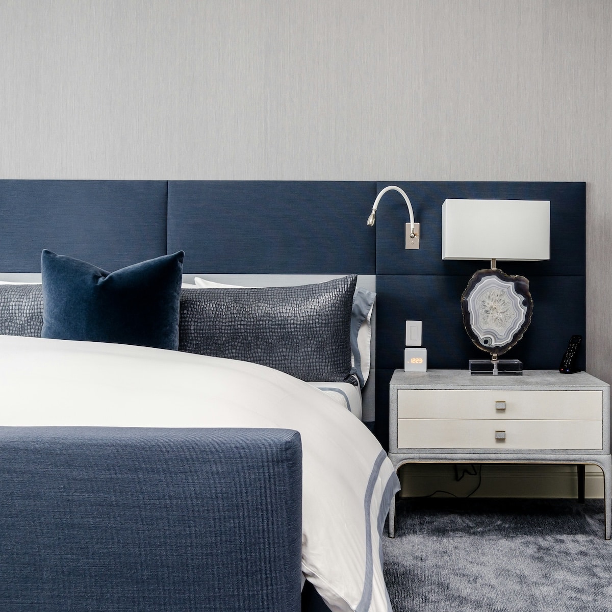
A navy duvet with crisp white pillows feels different from the same navy paired with clay and sand colors, even with identical furniture underneath.
Choosing A Palette That Matches Your Personality
Your ideal bedroom palette grows from your habits and personality, not from a single trend photo.
Some people restore energy in calm spaces with limited color, while others gain comfort from richer tones that feel expressive and personal.
A bamboo duvet cover makes a statement without shouting, since natural fibers pair well with earthy colors, gentle greens, and off-whites that echo the materials.
When you place a main piece like that at the center of the room, you gain a starting point for the rest of the palette.
Throw pillows, sheets, and throws can repeat one or two colors from the duvet and add variation through texture instead of completely new shades.
Memories of favorite places offer strong clues. Someone who relaxes near the ocean often gravitates toward layered blues and sandy neutrals.
A person who loves forest hikes tends to choose moss, bark, and soft cream.
Pulling two or three of these tones into bedding brings those associations into daily life and turns the bed into a visual reminder of spaces that feel safe. If you need help identifying complementary shades that work together, a Color palette generator can quickly show you harmonious combinations based on your chosen starting color.
🤖 Looking For An Answer?
Ask AI to summarise this post to see if the article answers your questions:
Balancing Neutrals, Accents, And Patterns
Neutrals form a reliable base for any bedroom and keep the room from feeling chaotic. White, cream, beige, taupe, and soft gray all support stronger accent colors without competing with them.
A neutral main duvet with colorful shams or a patterned throw lets you change the mood without replacing everything.
Accent colors add character and direction. Deep green can make a room feel rooted and calm. Rust or clay adds warmth that feels grounded instead of loud.
Blush or dusty rose brings softness without drifting into childish tones. Two accent colors usually provide enough interest, while a third works best in very small doses.
Light, Texture, And Seasonal Shifts
Daylight and artificial light change how bedding colors appear. A cool gray that looks elegant in a bright showroom can feel cold in a north-facing room.
Warm white bulbs soften blues and greens, while cool white bulbs sharpen them.
Checking fabric swatches or laid out bedding in morning, afternoon, and evening light gives a truer sense of how the color actually behaves.
Texture adds another layer to the mood. Linen in soft earth tones creates a relaxed, lived-in feel that works well in casual spaces.
Cotton percale in white or pale colors feels crisp and tailored.
Sateen weaves with deeper shades, such as charcoal or plum, create a more dramatic, hotel-style impression.
Different textures in similar colors keep the look rich without crowding the eye.
Practical Tips For Confident Color Decisions
A simple color rule helps many people avoid confusion. Choose one main color for the duvet, one secondary color for shams or pillows, and one accent color for throws or small cushions.
Keep everything else within a neutral range. This structure gives enough variety without drifting into a crowded palette that feels restless.
Pay attention to how colors interact with your skin tone. Bedding sits close to your face each morning and evening, and certain shades make you look well rested, while others emphasize shadows.
Standing near a mirror with a pillowcase or folded sheet under your chin quickly shows which colors flatter you more.

- Parents Are Prioritising Breathable, Sustainable Fabrics For Children's Seasonal Sleepwear
- Our Homemade Christmas Printables, Made With AI: What Worked, What Didn't, and What I'm Saving for Next Year
- At-Home vs. In-Lounge IV Therapy in the Hudson Valley: Which Makes More Sense?
- Can Passengers Pursue Compensation After a Car Accident?




Thoughtful color planning does not demand strict rules or design credentials. It simply asks you to notice how your body and mind respond to different shades.
Each adjustment, from a new duvet to a small throw pillow, can move the space closer to the mood you want.
Over many nights, that aligned environment helps sleep arrive more easily, and mornings begin with a little more calm.





Leave a Reply