

You don’t need a huge budget or a full-time tech person to have a website that looks professional and brings in customers.
DesignRush from the USA recently highlighted how small creative brands can stand out online, and you can do the same with a few simple changes.
Think of this as a weekend project that will make your site feel more welcoming, easier to use and far more likely to turn visitors into buyers.
Jump to:
Make Your Homepage Feel Like a Welcome Mat
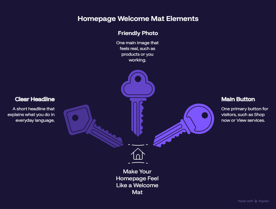
When someone lands on your site, they should instantly know who you are and what you offer. A clear headline, a friendly photo and one main button can do more work than a crowded layout and ten different messages.
Start with a short headline that explains what you do in everyday language. For example, “Colourful handmade jewellery for busy moms” or “Cosy crochet gifts made with love in my home studio.”
Skip stiff phrases and keep it warm, like you’re talking to a friend who just asked, “So, what do you make?”
Next, choose one main image for the top of your homepage. Use a photo that feels real: your products on the table, you working at your desk or a simple flat lay of your best sellers.
Now add one primary button, such as “Shop now,” “View services” or “Work with me.” This is your main action for visitors. You can have other links, but this one should stand out.
2. Use Cosy, Clear Language
Your website copy doesn’t need fancy marketing phrases. It needs to sound like you.
Readers of family and lifestyle blogs are used to warm, conversational writing.
If that’s your audience, talk to them the way you’d speak over coffee at the kitchen table.
Short sentences, everyday words and a friendly tone instantly feel more welcoming.
Address the reader directly. Use “you” instead of “the customer” and “I” instead of “the business owner.”
For example, “You can pick from three bracelet styles, and I’ll customize the colors just for you.” This makes the reader feel involved, not talked at.
Avoid filler phrases and complicated explanations. You want visitors to understand quickly, smile and click.
3. Keep Your Menu Simple and Stress-Free
Your navigation menu is like a signpost. If it tries to point in ten directions at once, people give up and leave.
Aim for three to five main items in your menu. Common choices are Home, Shop, Services, About and Contact. If you write blog posts, you can add Blog as a separate item or tuck it under Home if you prefer.
Use short, familiar words on your buttons and links. “Shop,” “See more,” “Learn more,” “Contact,” “Book now.” When everything is easy to find, people are more likely to stay, click and buy.
4. Make Sure Your Site Is Friendly on Mobile
Many of your visitors arrive on their phone screen, often while juggling kids, work or errands.
If your website is hard to use on a small screen, people leave fast. You don’t need advanced skills to give your site a quick mobile check and fix obvious problems.
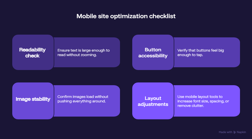
Grab your phone and open your website. Scroll through each page as if you were a new visitor. Is the text large enough to read without zooming?
Do buttons feel big enough to tap? Do images load without pushing everything around? If anything feels awkward, note it.
If you use a website builder, most offer mobile layout tools. Even small changes (increasing font size and spacing or removing clutter) can make a big difference. A site that feels easy to use on a phone instantly feels more professional.
5. Add “Helpful Extras” That Build Trust
Little touches can help visitors feel comfortable and confident about buying from you. Helpful extras answer questions, show your personality and prove that you are a real person behind the brand.
Start with a short FAQ section. Think about questions people ask you on social media or in messages: shipping times, returns, custom orders, materials, care instructions.
Create a “Work with me” or “Services” page if you offer custom work. Describe what you do, who it is for and the process flow from start to finish. Use bullet points and simple steps.
Show a bit of social proof. If you have reviews, kind messages from customers or photos of your work in use, share a few on your site.
Finally, make it easy for people to reach you. A contact form, a visible email address and, if you are comfortable, a social media link help visitors feel they’re dealing with a real person. When questions are easy to ask, bookings and orders are easier to make.
6. Turn This Into a Weekend Project
This doesn’t have to drag on for months. You can break it into small steps over a single weekend or two.
On day one, focus on your homepage: headline, main image and primary button. On day two, tidy your menu, check mobile and add a simple FAQ.
- Parents Are Prioritising Breathable, Sustainable Fabrics For Children's Seasonal Sleepwear
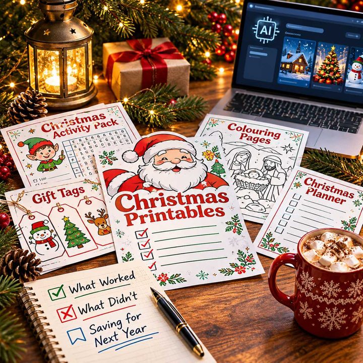
- Our Homemade Christmas Printables, Made With AI: What Worked, What Didn't, and What I'm Saving for Next Year
- At-Home vs. In-Lounge IV Therapy in the Hudson Valley: Which Makes More Sense?
- Can Passengers Pursue Compensation After a Car Accident?



As you go, remember that your creative business is personal. Your website should feel like you, not like a corporate brochure.
Keep your tone warm, your language clear and your layout simple.
Visitors will find what they need faster, feel more comfortable and be more likely to become customers.



Leave a Reply