

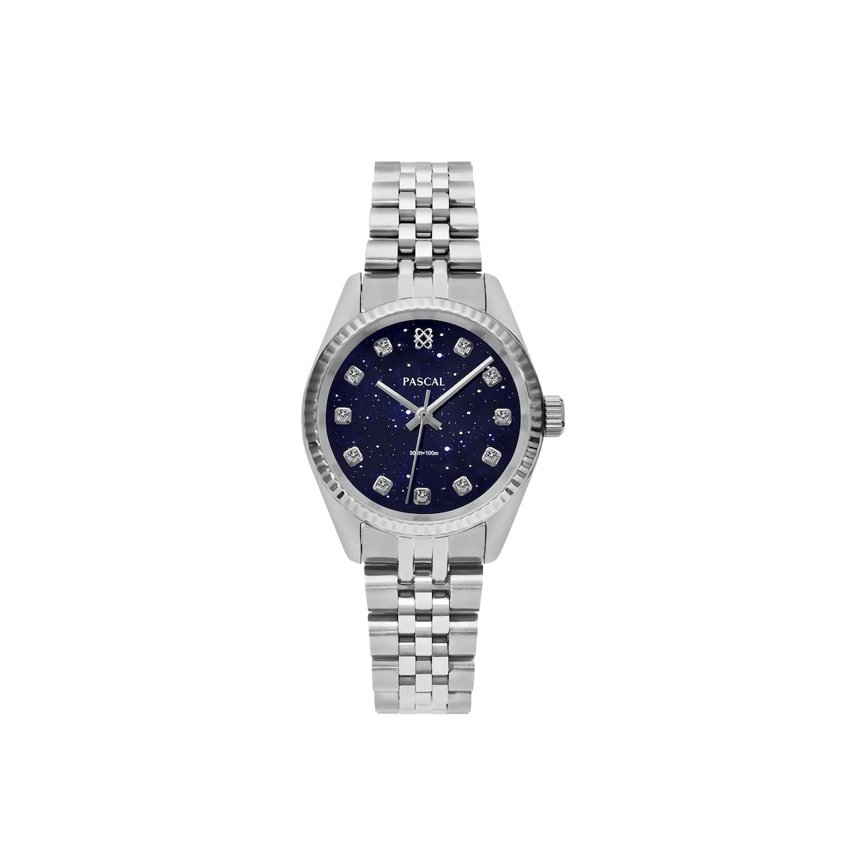
Color is the first thing people notice on your wrist. PASCAL Watches offer a range of colors that can elevate your style. Whether you're dressing up or keeping it casual, the right watch color can make a big difference.
This guide explores how PASCAL Watches use color to enhance personal style. Dark dials can add a crisp, grounded feel, while bright tones can make a bold statement. Even small changes in color can affect how your watch looks with different outfits.
Color also plays a role in luxury watches beyond just looks. Certain finishes reflect light in unique ways, and rare colors can make a watch feel exclusive. In the PASCAL Watch Collection, the right color can turn a practical choice into a standout piece.
We'll dive into what different colors mean and how to match them with your outfits. You'll learn to create a simple watch wardrobe with neutral colors and one bold statement piece. The aim is to find colors that complement your skin tone and avoid style clashes.
Jump to:
The Psychology of Watch Colors
Watch color speaks before you do. In the U.S., it shows up during handshakes, quick waves, and coffee-line chats. With designer wristwatches, that small flash of color can shape how calm, sharp, or approachable you seem.
For men’s fashion watches and women’s luxury watches alike, color can lift your mood, too. A tone that feels “right” can steady nerves in an interview or add ease at a wedding. It’s quiet, but people pick up on it fast.
How color influences mood, confidence, and first impressions
Color works like a shortcut for the brain. Dark shades can feel serious and controlled, while lighter tones often read open and fresh. Because a watch sits near your hands, it gets noticed when you point, gesture, or pass a card across a table.
At client meetings or networking events, a well-chosen hue can support the message you want to send. The goal is not to “match everything,” but to look intentional. That’s why many designer wristwatches offer strong dial colors alongside classic metals.
What black, white, gold, green, and blue communicate in personal style
Black is classic and low risk. It tends to read formal, focused, and minimalist, which is why it’s common in men’s fashion watches for work. White feels clean and modern, and can look sporty or runway-ready depending on the finish.
Gold signals celebration and confidence. In women’s luxury watches, it can feel timeless with a soft polish, or bold with high shine and bigger links. Green feels current and a bit expressive, from muted olive to deep emerald.
Blue is calm and trusted, and it plays well with denim and navy tailoring. It can move from office hours to weekends without a lot of thought. If you want one color that blends in while looking special, blue often delivers.
Dial vs. strap color impact: which people notice first
From a few feet away, the strap or bracelet creates the main block of color. Up close, the dial becomes the focal point. A light dial with a dark strap often looks crisp, while matching tones feel smooth and understated.
Straps are easier to swap, so they’re a quick way to shift the vibe. The dial is harder to change, so it sets the long-term personality of the piece. Many designer wristwatches lean on this balance: a signature dial paired with flexible strap options.
Choosing colors by skin tone and undertone for a more flattering look
Start with undertone: warm, cool, or neutral. Warm undertones often look natural with gold and warmer greens, while cool undertones tend to pair well with steel and blue. Neutral undertones can wear most colors, so contrast and outfit choices matter more.
Try the watch in natural light, not just store lighting. Look at it next to everyday staples like a white T-shirt, a black coat, or a navy suit. This simple check helps men’s fashion watches and women’s luxury watches look better on the wrist, not just in the case.
Matching PASCAL Watch Colors to Outfits
Styling your watch by PASCAL right is key. Choose a watch that complements your outfit, not just adds to it. This approach is also true for luxury watches, where every detail matters.
For formal events, pick watch colors that don't clash with the lights. Black, deep blue, or white dials look great with suits. They won't compete with your tie or pocket square. Also, keep the metal simple to match your shoes and cuff links.
In business settings, versatility is important. Blue, black, and white watches go well with both navy and charcoal. A subtle green dial can add a modern touch, as long as your outfit is neat and fitted.
On casual days, you can get creative with colors. Green or bright blues look good with denim and casual clothes. A neutral dial with a colored strap is a simple way to add some flair.
Consider the event and photos when choosing your watch. At weddings and parties, deep tones and true whites look good in mixed lighting. For outdoor events in summer, lighter dials can be refreshing, paired with a darker strap.
Choosing the right dial and strap combo is important. Match cool dials with cool straps or use contrast, like a white dial on a black strap. Make sure your watch matches your belt, shoes, and other accessories.
How the watch finishes affects its color. Matte surfaces are more subtle, while polished steel catches the light. Brushed metal is calmer and blends well with textured fabrics.
This attention to detail is what makes swiss made timepieces special. When color, texture, and metal work together, the watch becomes part of your outfit. This is how luxury watches make a statement without being too obvious.
Limited Editions and Trend Colors in Luxury Watches
Color can make a watch stand out, like when a brand releases a unique shade. In a world of similar watches, special colors make high-end ones pop. They do this without changing the watch's overall look.
Having a unique watch can feel special. It's not just about the hype. It's about a dial you remember, better resale value, and owning something rare.
Why limited hues can boost collectability in high-end timepieces
Scarcity makes a watch more desirable. When a model comes in a special color, like blue-gray or smoked green, it feels more personal. This makes it stand out from the usual versions.
For many, owning a unique watch is practical too. A special color makes it easier to spot in photos and talk about. It's also a good reason to keep it in your collection.
Trend-forward colors vs. timeless classics in designer wristwatches
Classic colors like black, white, and deep blue are always safe. They go well with many outfits, from casual to formal. That's why many designer watches stick to these colors.
On the other hand, trend-forward colors like bright greens or metallic finishes add excitement. But they might feel out of place soon. It's best to have them as a second watch.
How to pick a color that feels current without looking dated
Choosing muted trend colors is safer. For example, forest green is better than neon. Dusty blue is better than electric blue.
Think about how the color looks with your clothes, work dress code, and lighting. A dial might look great in daylight but different under office lights or at night.
What to look for in fine watch craftsmanship when evaluating special releases
A special color should not hide poor build quality. Look for even color, sharp edges, and durable coatings. These are signs of good craftsmanship.
Good color work also means the watch is easy to read. Strong contrast and clear details make the dial readable. This is key for both luxury and traditional watches.
Color as a Statement of Personality with PASCAL Watches
Color on your wrist can speak before you do. With PASCAL Watches, a dial and strap choice becomes a quiet signature that people remember. Wear black or white for a clean, minimalist look. Choose gold to lean into a luxe mood that feels polished.
Think of color as a shortcut to your style identity (佩戴颜色传递个人风格). Blue often reads classic and steady, while green can feel creative and fresh. Sporty wardrobes pair well with crisp, high-contrast tones.
For women's luxury watches, softer neutrals can look refined at brunch, then work for dinner plans.
- Parents Are Prioritising Breathable, Sustainable Fabrics For Children's Seasonal Sleepwear
- Our Homemade Christmas Printables, Made With AI: What Worked, What Didn't, and What I'm Saving for Next Year
- At-Home vs. In-Lounge IV Therapy in the Hudson Valley: Which Makes More Sense?
- Can Passengers Pursue Compensation After a Car Accident?




In the U.S., your calendar sets the tone. A commute and a business-casual office usually call for calm, repeatable colors that match belts, shoes, and bags.
Travel and weekends invite more play, with the watch as the one pop of color against denim, knits, or a simple tee.
Men's fashion watches can lean bold here, but stay sharp when the rest of the outfit stays neutral.
To build a “signature” impression (如何通过颜色打造“ ”手表印象), pick a core color family and stick with it often.
Let it echo across outfits, so your look feels consistent without trying. Then buy with purpose: one daily-driver shade you can wear nonstop, plus one statement hue for events.
With PASCAL Watches, that two-watch plan keeps your style personal, flexible, and easy to recognize.



Leave a Reply